

Part 1 | Part 2 | Part 3 | Part 4
Table of Contents
Inspirations for Claro
--Finding inspiration in many places
--Honoring Seven's legacy
Claro's current state
--A new future for Views UI?
The origins of Claro's design
--Keeping Claro's redesign lean
Conclusion
Across Drupal's storied history, perhaps the most noticeable — and visible — changes in the CMS's evolution have come from the redesigns of the administrative interface that underpin every user's interaction with the Drupal editorial experience. Now, with the release of the Claro administration theme, which replaces the Seven theme and focuses on content author and site builder use cases, Drupal has reached another important inflection point in the history of its user experience. Claro is a theme that prizes accessibility, usability, and Drupal's legacy of extensibility.
This author (Preston So, Editor in Chief at Tag1 and author of Decoupled Drupal in Practice) had the privilege of moderating a wide-ranging conversation about Claro on a Tag1 Team Talks episode with Cristina Chumillas (Claro maintainer and Front-End Developer at Lullabot) and colleagues Fabian Franz (Senior Technical Architect and Performance Lead at Tag1) and Michael Meyers (Managing Director at Tag1). In this multi-part blog series, we traverse the trajectory of Claro from its origins to its current state and dig into its design and development processes to learn more about how this administration theme came to be. In this second installment, we focus on the inspiration behind and execution of Claro's design.
Inspirations for Claro
If you are unfamiliar with the Claro administration theme for Drupal 8, I highly recommend returning to the first installment in this blog series to learn more about Claro itself, its origins, and its goals to better understand the rest of this blog post. In this section, we explore some of the sources of inspiration for Claro and how modern interaction patterns underlined the urgency of a refresh for Drupal's vaunted administration interface.
Finding inspiration in many places
Roughly one year ago, during the beginning stages of the Claro development process, the team expressed an ambitious vision. At the time, Claro's architects were primarily focused on the content author persona. Cristina Chumillas recalls during our conversation that "ideally for a content author, you should have a drag-and-drop interface" or something snazzy that would not only match modern expectations but also convey a sense of futuristic panache. The team worked towards an interface that approximated some of the patterns found in WordPress Gutenberg, as they were finding considerable inspiration in that project.
However, the obstacle Drupal presents is that reaching a certain threshold of impressive transitions and other expectations of interactive user experiences requires considerable JavaScript. In addition, the notion of substituting Drupal's entire administration interface with a dynamic JavaScript application was not feasible. As a result, the team took a step back to reconsider the technical options available to them — at the same time Gutenberg's accessibility fiasco occurred — and determined that a better choice was to release something sooner so that users could experiment with it rather than wait for foundations that may never be stable.
Honoring Seven's legacy
Another important consideration that lent urgency to the endeavor was the need to refresh at least some of the color scheme utilized in Drupal's user interface, as this was the source of some comments about the aesthetic outdatedness of the Seven theme. In the end, Claro is comprised of what Cristina calls a "grown-up" version of Seven with color changes, all of which was made possible over the course of many months with the help of many volunteers.
All in all, the change in Claro's vision away from reinventing the wheel for Drupal's front end allowed for a more realistic and achievable end result to emerge in order to replace the Drupal user interface in a more sustainable fashion. Because Claro is ultimately based on the same stylesheet as Seven, the key advantage that Claro has over a solution such as a JavaScript application is that stability is not a concern.
Claro's current state
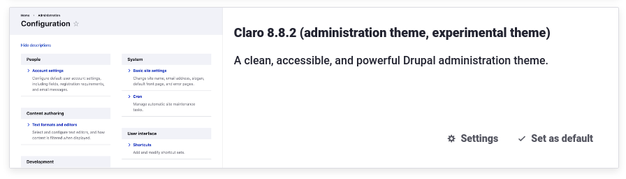 Claro is a beta theme in Drupal 8.8, and in several releases, it is slated to become a stable core theme. As Cristina states in our Tag1 Team Talks episode, Claro is perfectly usable at this very moment, and there are several Drupal sites in production already making use of it on their own administration layers. The good news about the widening adoption of and interest in the Claro administration theme is that there is growing momentum for larger-scale modifications to many more interfaces than were touched initially.
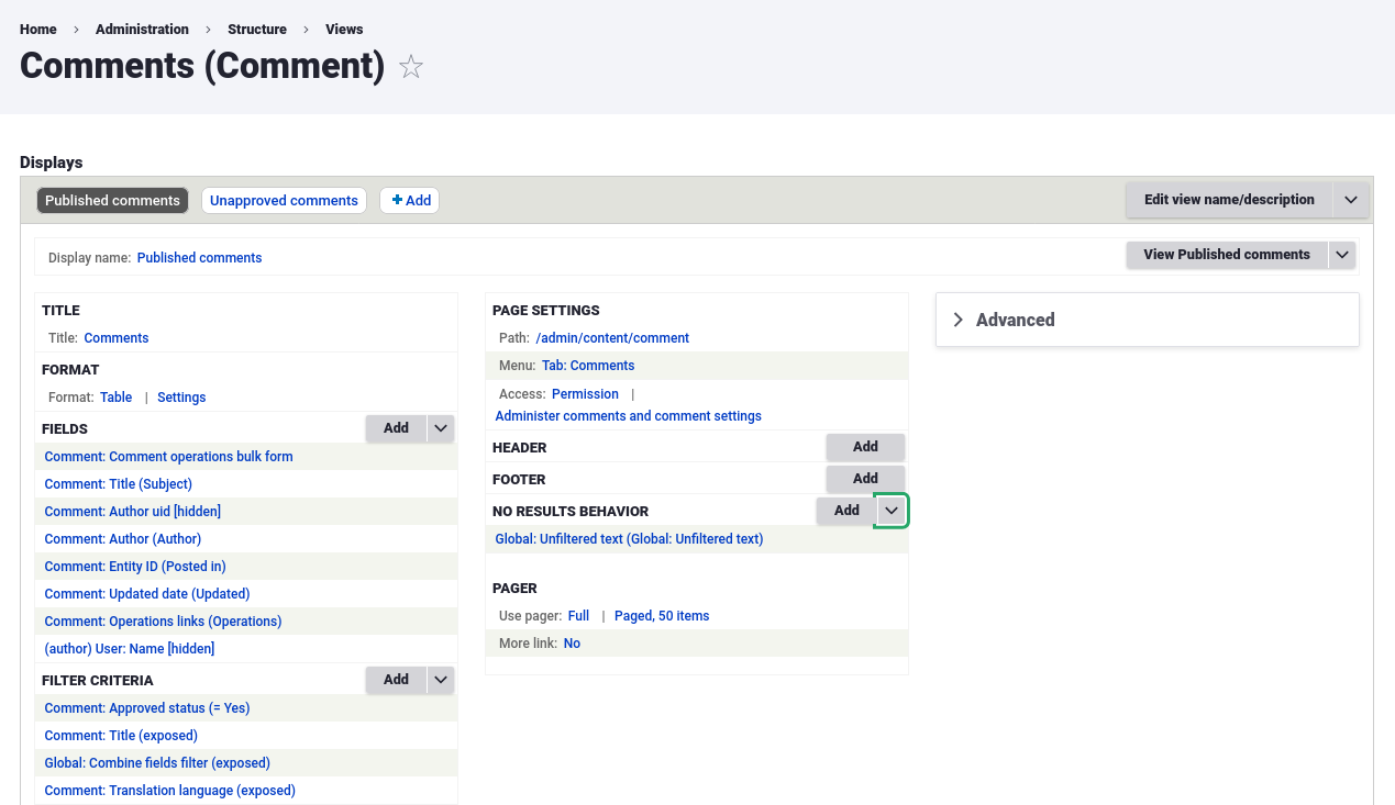
A new future for Views UI?
One of the chief examples of this momentum is strong interest in updating Views UI, which remains one of the most frequent user interfaces that Drupal users come in contact with. But as with all projects, Claro had the constraint of time and scope, and the team was loath to deem the stability of a redesigned Views UI a showstopper for a stable release of Claro. This situation would have led, Cristina argues, to a never-ending initiative without a finish line in sight.
 Cristina states during our webinar that eventually, the vision is to reach the place where all of Drupal's user interfaces have been redesigned from their previous Seven incarnations, from which point several other initiatives will kick off. But Cristina also rightfully adds that anointing an initiative with the responsibility of refreshing an administration interface cannot place every conceivable user interface under that umbrella if there is any hope of releasing a finished product within five years.
During our discussion, Fabian joined Cristina in recommending a strategy in which iterative initiatives that focus on regularly introducing small amounts of new features is the most sustainable form of initiative coordination. After all, at some point we must all decide that we are finished and there is no more to be done. In fact, the Claro team originally envisioned adding a new user role and even adding a second dashboard for content authors with draggable blocks, but questions quickly spiraled out of control, with suggestions for modifying the entire layout of Drupal's administration interface. Cristina admits that many portions of Drupal's administration layer will require initiatives in their own right in order to handle the inevitable demands that a redesign of a complex user interface will bring.
The origins of Claro's design
The initial ideas for the design of the Claro administration theme emerged almost from the beginning, as Cristina recalls during our Tag1 Team Talks episode. During those first discussions, it became readily apparent that any new administration theme had to look sufficiently different enough from Seven such that the vast majority of Drupal users would immediately spot the difference. But Claro's redesign had many limitations, including in Drupal's own brand: It was considered anathema to Drupal's brand identity to change the color scheme to one involving red and green that didn't reflect Drupal's color consistency.
Keeping Claro's redesign lean
 While the Claro team had sought lighter and more vivid colors for Claro and looked for inspiration in sources like Material Design and other design systems available online, they also understood that they could not reinvent the wheel with a revolutionary design, not only due to technical considerations but also aesthetic concerns. After all, administration interfaces are not intended to be the center of attention; Cristina efficiently defines the optimal administration interface as "something that works and that people understand."
Because of this sentiment across the team, Claro's architects decided to eschew fancy buttons and fieldsets, such as one particular interaction pattern in which a text field would change its outline color and display an underline to add dynamism to the page. During the first accessibility review, however, the consensus was that an overly "fancy" design was not appropriate for all users and that sticking to basic design principles was a better approach. Trying to keep things focused and tight, the Claro team sought a brighter look, initially employing a neon blue that was eventually darkened due to accessibility concerns. In the end, most of Claro's design elements came together based on inspiration from other designs already in the wild, and the team did their utmost to adhere to known patterns.
Conclusion
With the new Claro administration theme, Drupal 8 joins the growing list of content management systems that have revamped their look and feel for their most important users: the site builders and content authors that use the CMS on a daily basis. Claro demonstrates the sort of scrutiny on personas that also suggests substantial attention paid to the needs of all users, whether that entails accessibility, usability, or extensibility. And thanks to the give-and-take that characterizes accessibility reviews and design sprints, Claro emerged from its development with an efficient design that recalls many known patterns and is therefore a familiar and eminently learnable interface.
In this blog post, we discovered some of the inspiration that Claro built upon to produce its subtle and modern design. We also discussed some of the motivations that led to some of Claro's design decisions, including the choice to eschew a neon blue color and simplification of interactions with text fields in order to limit unnecessary distractions. In the third installment of this multi-part blog series about Claro, we spotlight some of the accessibility considerations that went into Claro's design and development, among other topics.
Special thanks to Cristina Chumillas, Fabian Franz, and Michael Meyers for their feedback during the writing process.
Photo by Aaron Greenwood on Unsplash