

Part 1 | Part 2 | Part 3 | Part 4
Table of Contents
Accessibility in Claro
--Color
--Size and spacing
--Enabling better accessibility reviews
Scope
What makes Claro unique
--PostCSS
Conclusion
Throughout Drupal's existence, no other changes have made as much an impression on users as refreshes of the administrative interface in Drupal. Content editors and site builders have a long list of expectations when it comes to the editorial experience they wish to use, and surveys and tests had shown that Seven was showing its age. Now, thanks to Claro, the new administration theme for Drupal 8, user interfaces for all editors in Drupal are now optimized for accessibility and usability in addition to a realistic roadmap for the future.
Recently, Cristina Chumillas (Claro maintainer and Front-End Developer at Lullabot), Fabian Franz (Senior Technical Architect and Performance Lead at Tag1) and Michael Meyers (Managing Director at Tag1) sat down with me (Preston So, Editor in Chief at Tag1 and author of Decoupled Drupal in Practice) for a Tag1 Team Talks episode about the Claro administration theme and its bright future. In this multi-part blog series, we track the journey of Claro from beginnings to its current state. In this third installment, we uncover some of the ways in which Claro has improved outcomes for accessibility and stayed innovative in a fast-changing front-end landscape.
Accessibility in Claro
If you haven't yet read the first and second installments of this blog series, it's a good idea to go back to better understand where Claro came from and how it came to be. In this section, we examine some of the ways in which Claro prizes accessibility and ensures that Drupal users with disabilities can easily operate Drupal.
Color
 During our conversation, Fabian asked Cristina: "Will there be a dark mode (in Claro)?" Though a dark mode toggle isn't part of the minimum viable product (MVP) for Claro, Cristina agrees that it could be a valuable addition to the theme, initially as part of the contributed theme ecosystem and then eventually part of core. The notion of a dark mode brings up one of the central considerations for accessibility: the use of color.
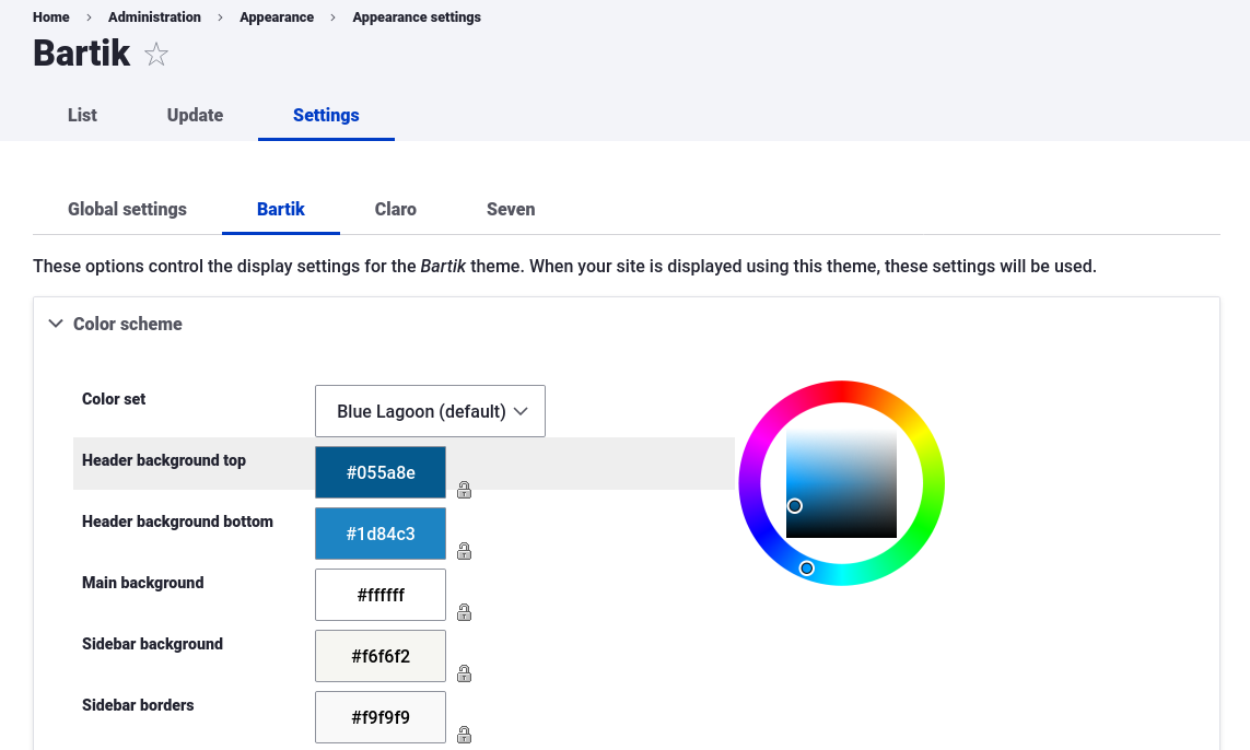
Currently, an issue on the Drupal Ideas queue proposes removing the Color module from Drupal core, a module that has been a mainstay of Drupal's available modules list for many years and allows the customization of Drupal themes through color variables. The discussion sparked a wide-ranging discussion about people wishing to customize the colors for administration interfaces for each customer. Though this is undeniably an interesting feature, the issue with offering color customization is that it grants far too much control to users who may configure color combinations that are inaccessible.
Size and spacing
Another piece of feedback that Claro received concerned what some perceived as too much additional space between form elements. Commenters wanted not only to see the elements displayed in a more compact manner but also to be able to customize the extent to which elements were spaced from one another, in addition to font sizes across the theme.
All of this has raised the important question of user customization of elements like size, spacing, and color and whether this sort of customization should be done at the theme level instead of in the user interface. Accessibility, after all, is hampered if a user sets a color scheme with insufficient contrast for certain users. One thing that Claro also implemented in Drupal's administrative interface was an increase in the font size across the board, as smaller font sizes are less accessible.
Enabling better accessibility reviews
A few months into development, the Claro team worked with Andrew McPherson, one of Drupal's accessibility maintainers, to review the designs for the administration theme and found important changes were necessary for elements like the aforementioned text field. An important discovery that the Claro team made was that providing a PNG or PDF file to a design reviewer and accessibility reviewer was less useful when the design isn't fully implemented in order to allow interaction testing as well.
Scope
Another key finding from Claro's development revolves around scope. In open source, of course, one of the fundamental constraints on project scope is always the number of contributor resources available to implement a given design. Having a tight release date also encourages a tighter scope, and Claro's team decided that having Claro ready for Drupal 8.8 was of paramount importance as otherwise Claro would possibly not have been eligible to become a stable theme in Drupal 8.8 or Drupal 8.9.
In the end, the team created a list of components that would be necessary to migrate from one theme to another, and though some of these continue to rely on Seven styles, they remain usable in Claro. By drawing a line in the sand and focusing on a revamp of the design first and foremost, without the risk incurred by engaging overly ambitious ideas like wildly new interfaces and layouts, Claro successfully entered Drupal core thanks in part to the constraints imposed by a narrow scope.
What makes Claro unique
Claro has been pushing the envelope when it comes to Drupal administration themes. Many common patterns now found on the web today are employed in Claro in lieu of the more "classic" components that Seven provided. Cristina says that Claro was "a chance to modernize the interface and get in a lot of patterns common around the web that make lives easier for users and I would say also for front-end developers."
PostCSS
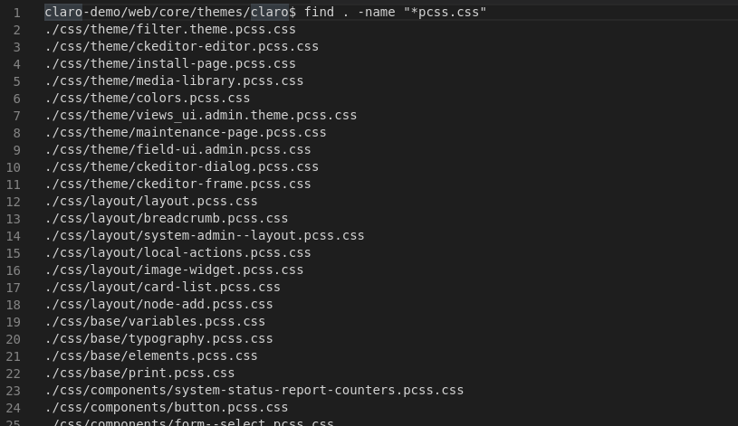 One of the key ways in which Claro demonstrates a high degree of innovation with regard to front-end development is the implementation of PostCSS for the administration theme. The Claro team decided explicitly not to utilize Sass as a Cascading Style Sheets (CSS) preprocessor, as is common in other Drupal themes. Instead, Claro uses PostCSS, a postprocessor for CSS, to provide features such as cross-browser support for CSS variables. Because Claro leverages PostCSS to process CSS written normally, it will remain compatible well into the future.
Although Sass offers many features that normal CSS did not offer several years ago, they provided many features that have now been integrated into CSS3 and modern browsers, which are receiving more regular updates and supporting specifications much more rapidly than before. This means that you can already access many CSS features provided by Sass in browsers including CSS variables — admittedly without Sass's unique features but also without the need for JavaScript to run the preprocessor.
Postprocessors, meanwhile, allow developers to write modern CSS with all of the vendor prefixes needed to support modern browsers. They change variables into functional code for CSS and converts the CSS you write into styles that will work in all browsers, including Internet Explorer. In Fabian's opinion, PostCSS can be considered a bridge from the old to the new much like a JavaScript shim in which one can use new language features available to the language but generate old JavaScript from the file.
Conclusion
 Claro is the new administration theme for Drupal 8, and it looks to be one of the most exciting developments for content editors and site builders in recent years, thanks to the design and development team's emphasis on accessibility, usability, and a narrow scope on implementing a moderate redesign rather than a fundamental rework. But Claro also demonstrates some of the key manners in which Drupal themes can be both accessible and innovative. Thanks to Claro's focus on providing accessible defaults, all users can successfully make use of the administration theme. In addition, with modern approaches like the use of PostCSS, a postprocessor that offers features like vendor prefixes for all modern browsers, Claro shows an innovative front end is possible for Drupal's administration layer.
In this multi-part blog series about Claro for Drupal 8, we have explored the history and origins of the Claro theme, some of the ways in which Claro addressed usability concerns, and how Claro has exemplified accessibility and front-end innovation. In this third installment, we spotlighted some of the ways in which Claro has allowed Drupal's administrative interfaces to become more accessible, including through font size, spacing between elements, and color contrast. We also inspected some of the additional features the Claro theme has added such as PostCSS, which obviates some of the need for CSS preprocessors thanks to the availability of features like CSS variables in modern browsers, and provides postprocessing to ensure vendor prefixes are present. In the following installment of this Claro blog series, we look forward to possible improvements to Claro and Cristina's dream vision for Drupal's new flagship administration theme.
Special thanks to Cristina Chumillas, Fabian Franz, and Michael Meyers for their feedback during the writing process.
Photo by Hulki Okan Tabak on Unsplash